Flex allows us to position elements more easily and we should look at elements using this model as either a:
flex container
flex item
Flex containers
To make an element a flex container (also known as a wrapper), we would add display: flex in its CSS...
.flex-wpr {
    display: flex
}
...then apply it in its corresponding HTML tag:
<div class="flex-wpr">
<!-- this is now a flex container -->
</div>
inline-flex
Using display: inline-flex creates a container that won't take up the full width so elements can exist beside the container:
.flex-inline-wpr {
    display: inline-flex
}

.non-flex-inline-wpr {
    display: inline
}
<div class="flex-inline-wpr">
    <!-- this is now a flex container -->
</div>

<div class="non-flex-inline-wpr">
    <!-- this can appear beside flex-wpr instead of under -->
</div>
Items within the container would still enjoy the flexbox layout!
Flex container properties
Aligning flex items with flex container properties
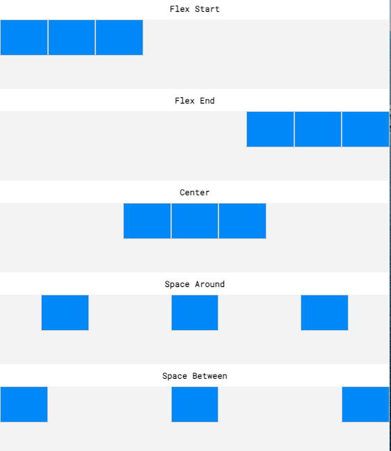
justify-content(horizontal alignment)flex-startflex-endcenterspace-aroundspace-between

...
<div class="flex-wpr">
    <div class="flex-item">a</div>
    <div class="flex-item">b</div>
    <div class="flex-item">c</div>
</div>
...
.flex-item {
    justify-content: flex-end;
}
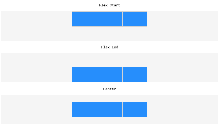
align-items(vertical alignment for a single row)flex-startflex-endcenter

align-content(vertical alignment for the entire flex container)flex-start(seealign-itemsfor diagram)flex-end(seealign-itemsfor diagram)center(seealign-itemsfor diagram)space-around(seejustify-contentfor diagram but vertically)space-between(seejustify-contentfor diagram but vertically)
Re-sizing flex items with flex container properties
flex-grow(let the items grow for large window sizes)- positive numeric value
xsets it toxtimes of its default grow size
- positive numeric value
flex-shrink(let the items shrink for small window sizes)positive numeric value
xsets it to1/xtimes of its the default grow sizea value of
0shrinks the item to the smallest possible
flex-basis(let the items grow/shrink with a limit)- positive numeric value +
px
- positive numeric value +
flex(shorthand combining grow + shrink + basis)flex: 2 1 150pxmeansflex-growof 2flex-shrinkof 1flex-basisof 150px
Arranging flex items with flex container properties
flex-direction(arrangement of items)row(items arranged from left to right, from the top left)row-reverse(items arranged from right to left, from the top right)column(items arranged from top to bottom, from the top left)column-reverse(items arranged from bottom to top, from the bottom right)
flex-wrap(let the items wrap to new lines)wrap(wrap items into new line if there's no space)wrap-reverse(same aswrapbut reverse the item order)nowrap(don't wrap)
flex-flow(shorthand combining flex-direction and flex-wrap)flex-flow: column wrapflex-directionof columnflex-wrapof wrap
Flex items
To make a block element a flex item, simply include them into the already-defined flex container:
<div class="flex-wpr">
    <div>a</div>
    <div>b</div>
    <div>c</div>
</div>
We will notice that the flex items will appear inline by default, rather than the full-width of the default <div>
From there, we can align, re-size and arrange these flex items with ease!
Review
setup
display: flex(make child divs inline)display: flex-inline(make itself inline among other divs)
alignment
justify-content(horizontal centering)flex-start,flex-end,center,space-around,space-between
align-items(vertical centering of container's items)flex-start,flex-end,center
align-content(vertical centering of entire container)flex-start,flex-end,center,space-around,space-between
resizing
flex-growflex-shrinkflex-basisflex(shorthand for the above three properties)
arrangement
flex-directionrow,row-reverse,column,column-reverse
flex-wrapwrap,wrap-reverse,nowrap
flex-flow(shorthand for the above two properties)
